Leaderboard
Popular Content
Showing content with the highest reputation on 10/27/21 in Posts
-

Happy Korbat Day!
midnight_spell360 and 3 others reacted to hrtbrk for a topic
Candy4 points -
Today's Random Events
Tedhaun and one other reacted to midnight_spell360 for a topic
While playing Sakhmet Solitaire I got the Relic Paint Brush! Yay! It's been 2 yrs since I won a PB.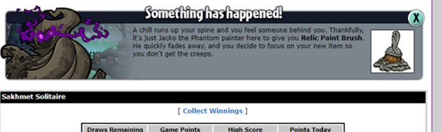 2 points
 -
Neopets Beta: 0.4.8 Release Notes!
Mouseykins reacted to hrtbrk for a topic
A long overdue Beta update is here bringing three new games, world maps for various locations in Neopia and the return of random events! Note: you can not currently earn Neopoints from playing these newly released games, however it is scheduled to be fixed this week. New in this update: Get ready to play Destruct-o-Match III, Faerie Bubbles and Ultimate Bullseye II. Enjoy the return of map locations for the following: Neopia Central, Neopian Bazaar, Neopian Plaza, Kiko Lake, Altador, Terror Mountain: Happy Valley, Terror Mountain: Ice Caves, Terror Mountain: Top of Terror Mountain. Random events will now appear on Beta pages. The next release is hoping to bring us more maps, pet slots and a brand new look for the Advent Calendar. Look for this update around the holidays. Full release notes here.1 point -

Happy Korbat Day!
midnight_spell360 reacted to Angeló for a topic
The Wings and Dari's Mask are a must have for my Dark Boutique1 point -

Happy Korbat Day!
midnight_spell360 reacted to jellysundae for a topic
I'm truly underwhelmed by the paint brush colour, but the outfit is *chef's kiss* Loving Gracie's concept for a bug paint brush though.1 point -
Happy Korbat Day!
midnight_spell360 reacted to Angeló for a topic
Another player design that they adopted (I believe this is the 4th one after Maraquan Kiko, Maraquan Lutari and Maraquan Jetsam) http://www.neopets.com/~Netger1 point -
Got this RE while frantically refreshing the Magic Shop hoping to snag a Faerie Acara MP! Cha-ching! Guess I'll just be selling this and putting it toward the price of just straight up buying the MP!
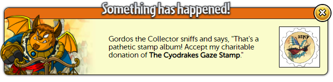
 1 point
 -
Happy Korbat Day!
midnight_spell360 reacted to GlitchtaleLover for a topic
Candy Corn-bat!! This one is perfect, and very fitting of the current month! And what else fits the spooky theme? Lord Darigan himself of course! Love the detail on the wings here : ) Magnificent day, Korbats!1 point -
Ah, okay. I assumed it was made by neo-faeriewings, as the tag with the background image still used one of their images. Either way, I think the dimensions of the image are key here, as the image currently isn't big enough to fill the page and accommodate all the info on the user lookup. It's possible to play with the size of the 'about me' section, as the text is included in the code you shared, but - as far as I can tell (I've never tried to make a user lookup before) - there's a limit to how small the 'user info' text + image can get. I've altered the #blog CSS to make it fit into the 'about me' section on your image: #blog { position: absolute; top: 160px; left: 370px; width: 170px; height: 175px; overflow: auto; } But I think you're going to need a bigger image to make the existing content of the user lookup fit properly. (I played around with the values of #userinfo by using the preview section of my own user lookup, and it's possible to alter top and left to get it in the correct spot, but no matter how small I made the width and height, at a certain point the content just wouldn't shrink any further, so I couldn't get it to fit into the 'user info' section on your image.) Oh, and I think the background image (for which you're currently using the neo-faeriewings image: background: url("http://www.neo-faeriewings.com/userlookups/neggfaerie2look2.jpg");) needs to be altered as well, as it needs to align with the border of the 'my trophies' section, and match the colours of this section and the background. (For reference, see this image from neo-faeriewings, which has the user lookup picture, and this matching background image.) Sorry I can't be of more help; my HTML/CSS knowledge is fairly limited, and my image design skills are nonexistent.1 point
-
The pets on my spooky account are spooky all year long1 point
-
Share your spooky customs!
Yuiina reacted to jellysundae for a topic
@Secre Thank you! I'm so thrilled that Stoopzy helped to inspire @Yuiinato get an invisible Kau too. and she used exactly the same reasoning as me, judging by item size/positioning and so on. I went for a quadruped because handhelds remain whole rather than having a hand-shaped chunk missing out of them, and the Kau head height/size worked best for the more random headgear and masks etc. that work well as floating objects. this custom (a dream which has since become a reality thanks to the utter awesomeness of ninjas!) is an excellent example of why I wanted an Invisible pet xD. I'll share the placement of the pets this works for. Usul: the blue one conscientiously enlarging the window there xDDD Tonu: Jetsam: The grin, that's unnerving! Gelert: Elephante: Your Blum choice: They seem determined to repel any visitors by boat. x'D I'd forgotten just how few Invisible pets the items do display for Dx I think it's the Jetsam that the most work for? but the grin being there somewhat defeats the object, doesn't it. What is your main intent for an Invisipet then? Mine was primarily for silliness, gotta admit, though really pretty and tranquil set-ups was there too. I just tend to not get around to doing them, maybe because conversation on the Shenkuu board triggers too much inspiration for setting up my fellow ninjas. For example: The regulars on there have ID emotes (I'm the ferocious negg but we'll not comment on that :P) This is Mario and this is Serg Serg is Italian, he has VIEWS about pasta (especially spaghetti with meatballs) so ofc, as his friends, we make sure to troll him about this, on the reg. So when I discovered a certain Neo-item, it went without saying that Stoopzy had a job to do! Totally made my day this did! Especially as the Meowy's expression can definitely be read as horror, and AAA looks awfully guilty. No getting out of this, mister! xD But now that I'm focusing on my past bullying of fellow ninjas I feel like going for a nice autumnal scene instead, with no meanness what-so-ever, hahaha. We'll see if that actually happens...1 point -
http://www.neopets.com/ntimes/index.phtml?section=585490&issue=946 My new article in the Neopian Times1 point